Create a New Safety Report Form
Overview:
- This enables you to create incident/accident/hazard report forms that can closely resemble your own existing paper forms. Anyone with a Student account in your system can fill in and submit reports.
- Reports can then be viewed by Safety Manager(s), tasks assigned and tracked, reports finalized and closed out.
- Each report is sequentially numbered for integrity in audits. Closed reports go into a company wide reports library. There are options for anonymity in the reports.
- Reports data can be exported to spreadsheets or analytics tools, but there currently is no analytics in this system.
- To create a new safety report form use the Safety Report Forms function.
Note: Only the Safety Manager role can create new Safety Report Forms.
Create a New Safety Report Form
- To begin, from the Safety Manager home page, click on "Forms".

- Click "+New Form" in the Blue Menu bar.

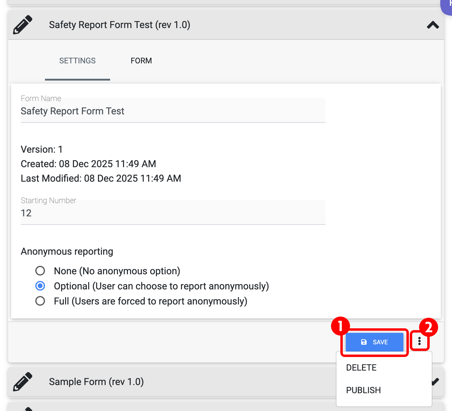
- You will now see the SETTINGS page. Here you will enter:
- Form Name (1)
- Starting Number of your Report (2) (this defaults to 1)
- Anonymous Reporting options (3)
- Once you have completed these steps, click FORM to continue (4)

How to use the Report Form Builder
You can add various elements to your report.
- Begin by adding a row (1) or a section (2).

- For the purposes of this example, begin by adding a Section. You can now name the Section on the right hand side, under Label (1). We can also choose to show borders (2).

- Now add a row to the Form, and you can begin adding elements. This will create the beginning of the body of the form. By default, the row will appear above the section we created in the previous step. You can easily move this row below the section by clicking and dragging on the 6 dots in the row.

Elements Overview in the Form Builder
Elements are located on the left side of the page, and contain the items used to add detail to your form.
Empty Space |
Add Text |
Add Image |
Add Text Input |
Add Multiple Choice |
Add Date Picker |
Add Time Picker |
Add Checkboxes |
Add Heading |
Note: you may only add up to 4 elements to any row.
Empty Space
This option will add an empty space between elements, or an entire row.
- The Empty Space
- Show Borders toggle - use this to show a border around the empty space.
- Column Size - Each Row has up to 4 spaces, and your column size is how many of these spaces your element will fill.
- Row Settings - use this to show a border around the entire row.

Add Text
Add text to your report!
- Your text Element. This is where the text you enter will appear in the report.
- Show Borders toggle - use this to show a border around the text element.
- Column Size - Each Row has up to 4 spaces, and your column size is how many of these spaces your element will fill.
- Text - This is where you will enter your text to show in the report. When you click in this window, the text editor will pop up (shown) and you will be able to format your text as required.
- Row Settings - use this to show a border around the entire row.

Add an Image
Add images to your report!
- The image element.
- Show Borders toggle - use this to show a border around the image element.
- Column Size - Each Row has up to 4 spaces, and your column size is how many of these spaces your element will fill.
- Image Button - Click here to add your image.
- Remove Button - Click here to remove your image.
- Row Settings - use this to show a border around the entire row.

Add Text Input
Allows the user of the report to add text. We recommend that the label of this element indicates what the user should be inputting here. Ie: Incident Details:
- Text Input Element
- Show Borders toggle - use this to show a border around the text input element.
- Answer is Required - means this element must be filled in on the user's report in order for it to be submitted.
- Redacted from public view - A layer of privacy for certain information in certain circumstances. If your Learning Center has a Safety Reports Library accessible, you may wish to select this toggle ON. This will have this field redacted from all Student viewing, and viewing of other roles when follow up items are assigned to other users.
- Column Size - Each Row has up to 4 spaces, and your column size is how many of these spaces your element will fill.
- Label - Indicates what should be entered in to the text input, IE: Incident Details:
- Multiple line input toggle - This will allow up to 5 lines of input, optioned when the toggle is ON.
- Row Settings - use this to show a border around the entire row.

Add Multiple Choice
Add a Multiple Choice element to your report
- Multiple Choice Element
- Show Borders toggle - use this to show a border around the text input element.
- Answer is Required - means this element must be filled in on the user's report in order for it to be submitted.
- Redacted from public view - A layer of privacy for information in certain circumstances. If your Learning Center has a Safety Reports Library accessible, you may wish to select this toggle ON. This will have this field redacted from all Student viewing, and viewing of other roles when follow up items are assigned to other users.
- Column Size - Each Row has up to 4 spaces, and your column size is how many of these spaces your element will fill.
- Label - Indicates the title for the multiple choice element.
- Horizontal options toggle - Selects how many columns would you like your choices to display in. If this toggle is OFF your choices will display in one column.
- Add option - Each time you select 'Add option' you will add a Multiple Choice option for the user of the report. You can enter the title in the line associated with the option.
- Row Settings - use this to show a border around the entire row.

Add Date Picker
- Date Picker Element
- Show Borders toggle - use this to show a border around the text input element.
- Answer is Required - RECOMMENDED - means this element must be filled in on the user's report in order for it to be submitted.
- Redacted from public view - A layer of privacy for certain information in certain circumstances. If your Learning Center has a Safety Reports Library accessible, you may wish to select this toggle ON. This will have this field redacted from all Student viewing, and viewing of other roles when follow up items are assigned to other users.
- Column Size - Each Row has up to 4 spaces, and your column size is how many of these spaces your element will fill.
- Label - Indicates what should be entered; IE: Date or Incident Date.
- Row Settings - use this to show a border around the entire row.

Add Time Picker
- Time Picker Element
- Show Borders toggle - use this to show a border around the text input element.
- Answer is Required - RECOMMENDED- means this element must be filled in on the user's report in order for it to be submitted.
- Redacted from public view - A layer of privacy for certain information in certain circumstances. If your Learning Center has a Safety Reports Library accessible, you may wish to select this toggle ON. This will have this field redacted from all Student viewing, and viewing of other roles when follow up items are assigned to other users.
- Column Size - Each Row has up to 4 spaces, and your column size is how many of these spaces your element will fill.
- Use 24 hour format toggle - Toggle ON to use 24 hour format.
- Label - Indicates what should be entered; IE: Time or Incident Time.
- Row Settings - use this to show a border around the entire row.

Add Checkboxes
Add a Check Box element to your report.
- Check Box Element
- Show Borders toggle - use this to show a border around the text input element.
- Redacted from public view - A layer of privacy for certain information in certain circumstances. If your Learning Center has a Safety Reports Library accessible, you may wish to select this toggle ON. This will have this field redacted from all Student viewing, and viewing of other roles when follow up items are assigned to other users.
- Column Size - Each Row has up to 4 spaces, and your column size is how many of these spaces your element will fill.
- Label - Indicates what should be entered; IE: Weather.
- Horizontal options toggle - Selects how many columns would you like your choices to display in. If this toggle is OFF your choices will display in one column.
- Add option - Each time you select 'Add option' you will add a Check Box option for the user of the report. You can enter the title in the line associated with the option.
- Row Settings - use this to show a border around the entire row.

Add Heading
Add a Heading Element to your report.
- The Heading element.
- Show Borders toggle - use this to show a border around the image element.
- Column Size - Each Row has up to 4 spaces, and your column size is how many of these spaces your element will fill.
- Label - Enter the Title line for your Header here.
- Fill heading toggle - (Default is ON) Toggle to fill your header bar.
- Row Settings - use this to show a border around the entire row.

Example Report:

Save / Publish:
When done editing, click "SAVE" (1) to save your report as a draft. When all edits are complete and you are ready to publish, click the ellipsis (2) and choose "PUBLISH" To delete or archive the report after publishing, use the ellipsis.